Cleaner Mobile Layouts
Your text, buttons, and images stay readable on smaller screens, which reduces the chance of visitors leaving after a few seconds.

WebGLITS is a web design and development company based in Nagercoil, Tamil Nadu. We are a dedicated team of website designing professionals helping businesses unlock the full potential of the Internet with professional websites at very low cost.
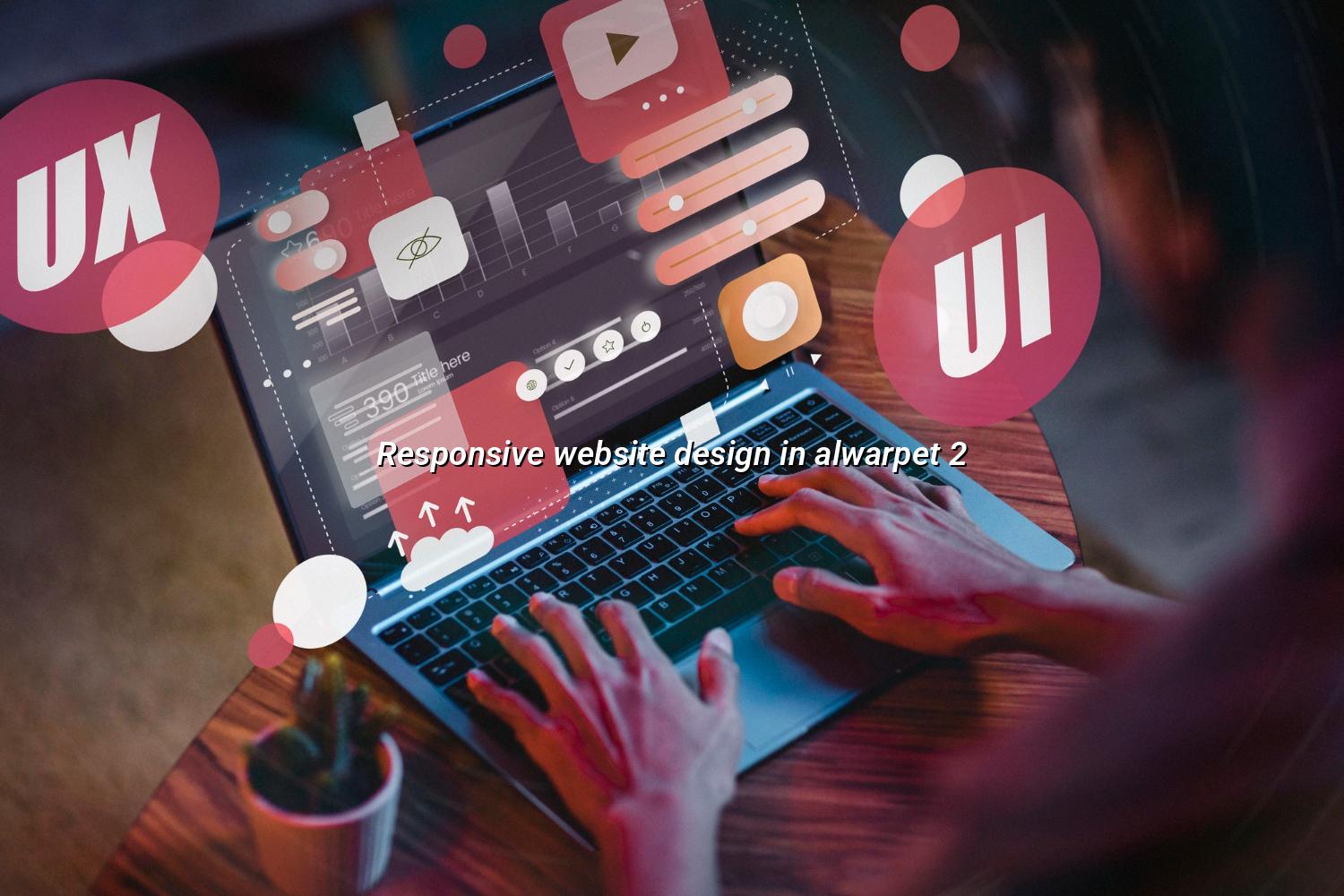
Responsive website design in Alwarpet helps your business look sharp on phones, tablets, laptops, and large desktop screens. That matters when a visitor opens your site during a cab ride, a lunch break, or a quick search from home and expects the page to load, read well, and guide them to call or message you.
We work with shops, clinics, professionals, and service businesses that want a better first impression in Chennai without making the site feel heavy. WebGLITS builds from Nagercoil and supports clients across Tamil Nadu, so your Alwarpet audience gets a website that is easy to use, clean, and ready for real enquiries.
GET IN TOUCH GET IN TOUCHWe start by looking at what your visitors actually need to do. If the main goal is calls, WhatsApp messages, bookings, or quote requests, the design is shaped around that action instead of decorative extras. That approach keeps the site practical for Alwarpet users and easier to maintain later.
A short menu is easier to use on small screens, especially when someone is searching quickly on a phone in traffic or between meetings.
We avoid oversized pictures that slow the page and instead keep the visuals sharp enough for service pages, galleries, and product sections.
Phone and WhatsApp actions work best when people can reach them without scrolling around, so we place them where they earn attention fast.
Businesses change services, timings, offers, and festival messages often, so we keep the structure manageable for later updates.
| Step | What We Do | What You Get |
|---|---|---|
| 01 | Review your existing pages, goals, and contact flow. | A clear plan for the layout and content structure. |
| 02 | Design the mobile and desktop views together, not separately. | A site that feels consistent across screens. |
| 03 | Test spacing, readability, and buttons on common devices. | A friendlier experience for real visitors. |
| 04 | Refine the content so the right actions stand out first. | More direct enquiries from people who are ready to contact you. |
If your current site feels cramped on mobile, we can help reshape it into something easier to read and quicker to use. Send us a message and we’ll talk through the pages, the menu, and the best next step.