Phone-Friendly Layouts
Your pages stay readable on smaller screens, so visitors don’t give up halfway through.

WebGLITS is a web design and development company based in Nagercoil, Tamil Nadu. We are a dedicated team of website designing professionals helping businesses unlock the full potential of the Internet with professional websites at very low cost.
Responsive website design in Cuddalore helps your business look sharp on phones, tablets, and desktops without forcing people to pinch or scroll awkwardly. We build pages that are easy to read, quick to use, and ready for real customers who want to call, message, or check details fast.
If you run a shop, school, clinic, hotel, or service business in Cuddalore, your visitors are likely checking you from a mobile screen while they’re on the move. WebGLITS works from Nagercoil and serves businesses across Tamil Nadu, so we know how to shape a website that suits local browsing habits, low-data users, and plain practical needs.
GET IN TOUCH GET IN TOUCHA good mobile layout is not just about shrinking everything down. We look at the real behaviour of your visitors, then shape the site so the important parts come first on small screens. That means your phone number, enquiry buttons, and service details are easy to reach.
We decide what the visitor should do first, then put that action where it’s easy to see on mobile.
Short headings, neat spacing, and simple blocks help people read more before they leave.
We check the layout on common phone widths, tablet views, and desktop screens so nothing feels broken.
We focus on what helps your customers in Cuddalore call, enquire, or visit your business without confusion.
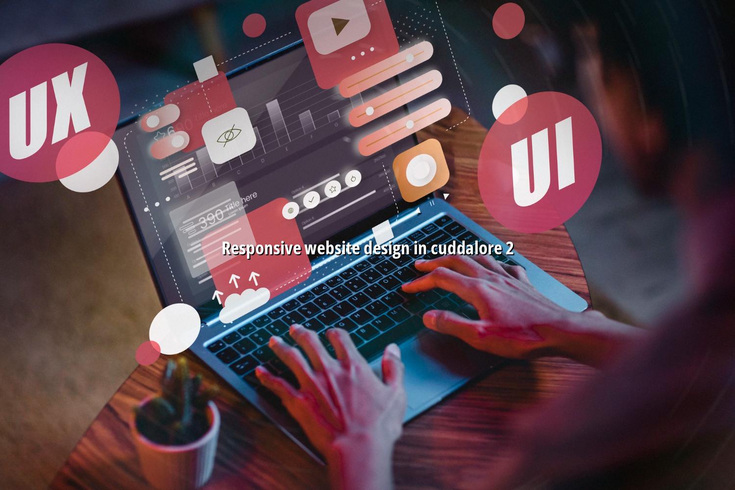
Many Cuddalore businesses ask for a nicer-looking site, but the real issue is often how the site behaves on a phone. This quick reference shows the parts we normally review when planning responsive website design in Cuddalore.
| Area | What We Check | Why It Matters |
|---|---|---|
| Layout | Content should stack neatly and keep the main section visible first. | Visitors can understand your offer quickly on a narrow screen. |
| Menu | The menu must open cleanly and stay simple to tap. | People can move to services, about, or contact without frustration. |
| Forms | Fields should be easy to fill with a thumb keyboard and clear labels. | Better forms usually mean more enquiries from mobile users. |
| Speed | Images, scripts, and page elements should stay controlled. | A faster page helps users stay on the site, even on weaker data connections. |
If your current site feels cramped on phones, we can help you reshape it for real users in Cuddalore and across Tamil Nadu. Reach out and we’ll talk through the pages, features, and design style you need.